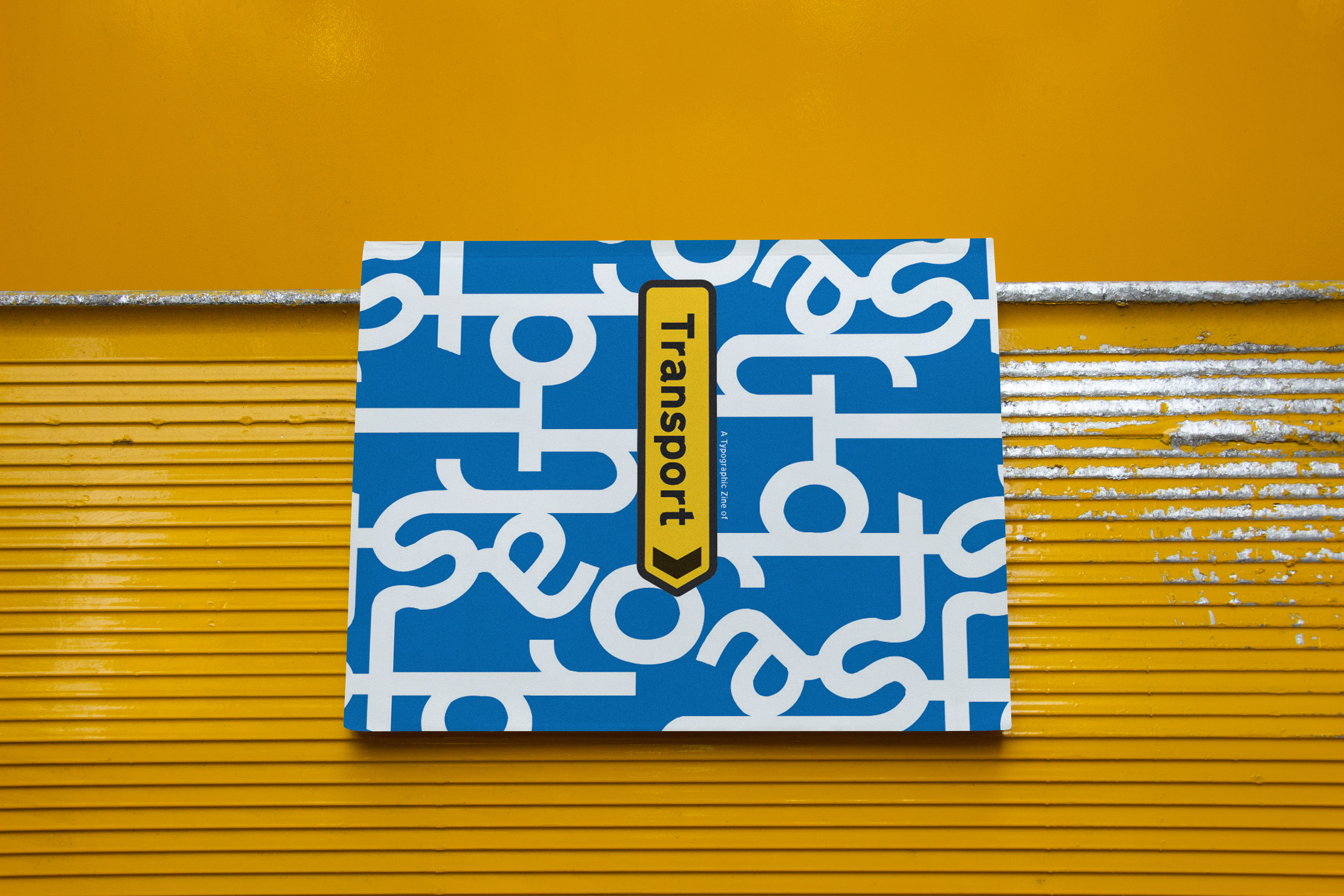
Creative Process of the Zine: Transport
Research on Typographic Zines and Posters
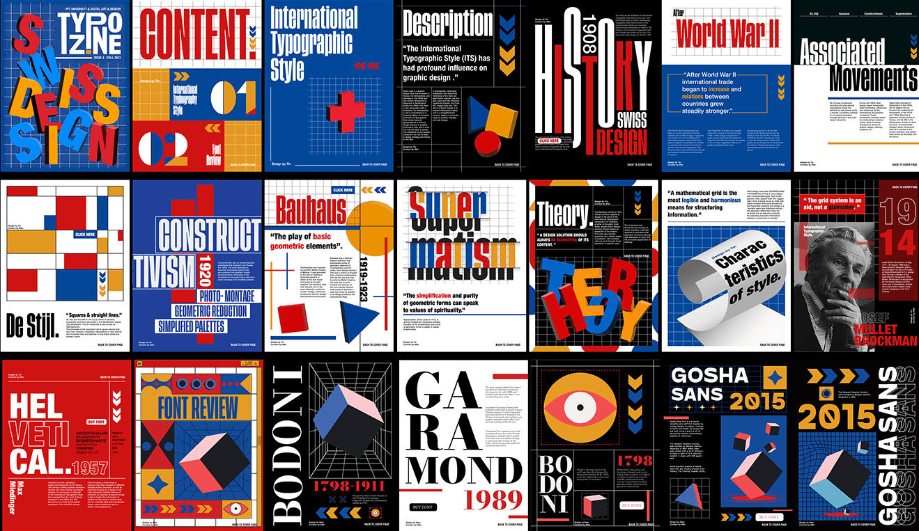
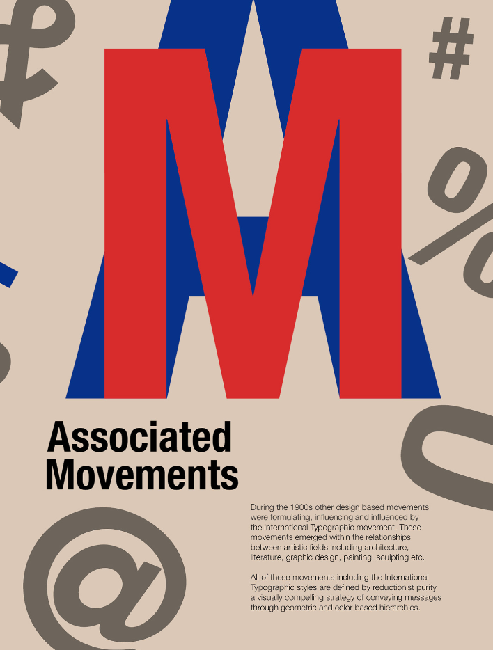
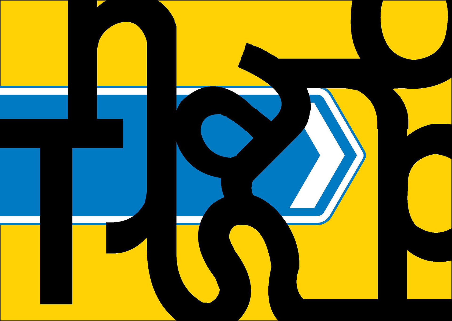
TYPOZINE | SWISS DESIGN | POSTER | IPAD VERSION
Source: https://www.behance.net/gallery/183651463/TYPOZINE-SWISS-DESIGN-POSTER-IPAD-VERSION/modules/1037930695
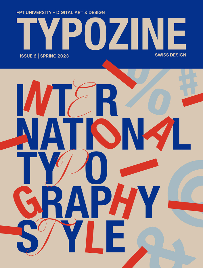
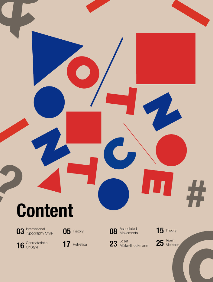
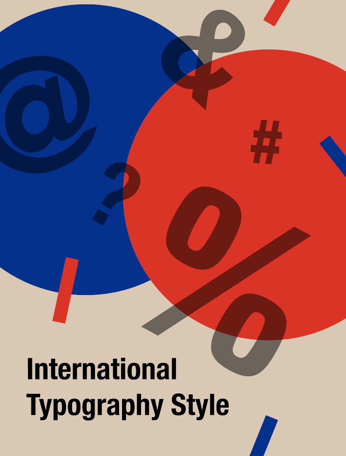
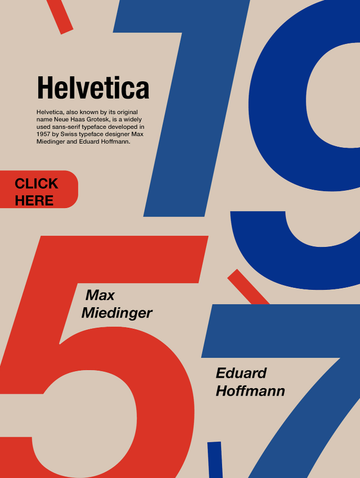
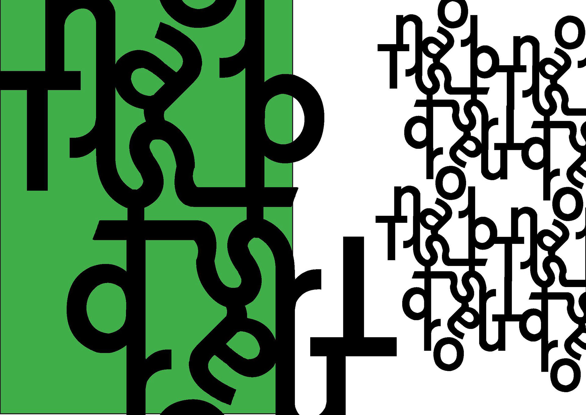
TYPOZINE: INTER NATIONAL TYPO GRAPHY STYLE
Source: https://www.behance.net/gallery/175780955/TYPOZINE-INTER-NATIONAL-TYPO-GRAPHY-STYLE
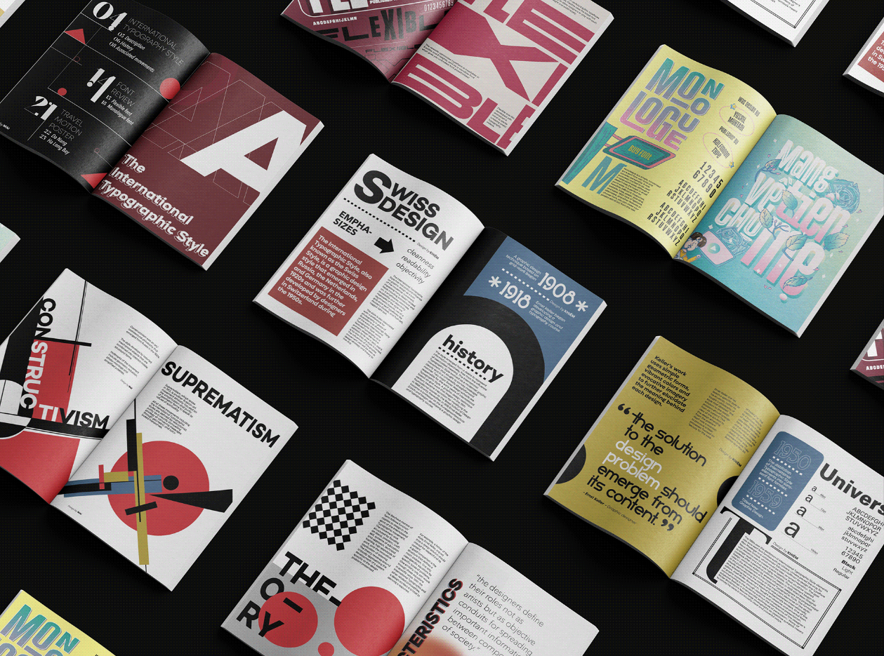
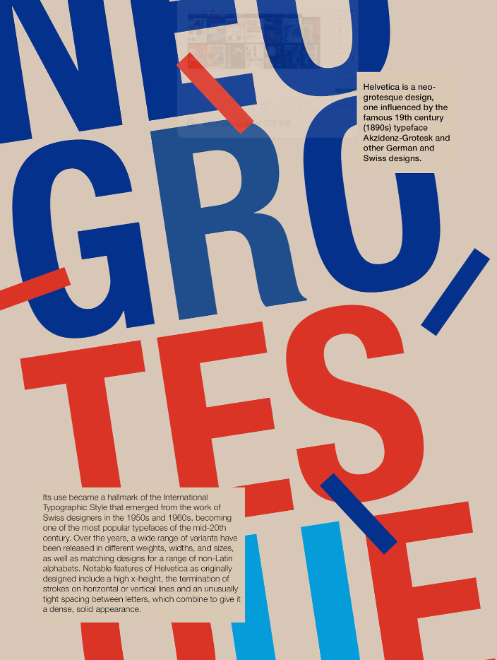
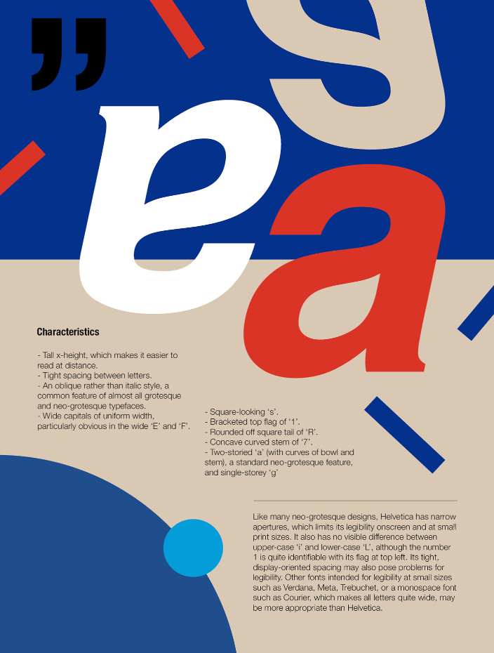
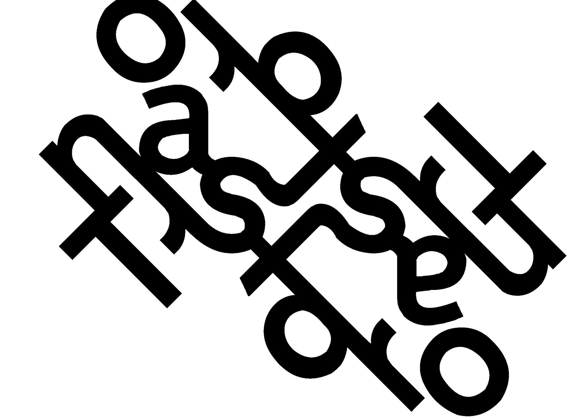
TYPOZINE MAGAZINE
Source: https://www.behance.net/gallery/149022609/TYPOZINE-MAGAZINE/modules/987766063
The Reason for Choosing Transport
A while ago in Hong Kong, the local Highways Department made an uncommon move by replacing about 60 street signs in selected districts with a new typeface intended to "infuse a rich cultural ambience in the community." However, these new replacements were not well received. Concerns arose regarding the functionality and legibility of the featured font. This situation made me notice that it's often only when something changes that we recognize the greatness in what they were. It also made me curious about the original typeface used and what made it work so well. This curiosity led me to discover the typeface Transport and the fascinating story behind it. Through this zine, I hope to offer a new perspective and inspire the reader to recognize and appreciate the remarkable details in our daily lives that we do not usually pay attention to, and a reminder to not take our surroundings (which we are so used to) for granted.
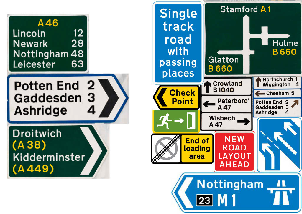
Research on Road Signage
Initial Draft and Thumbnails
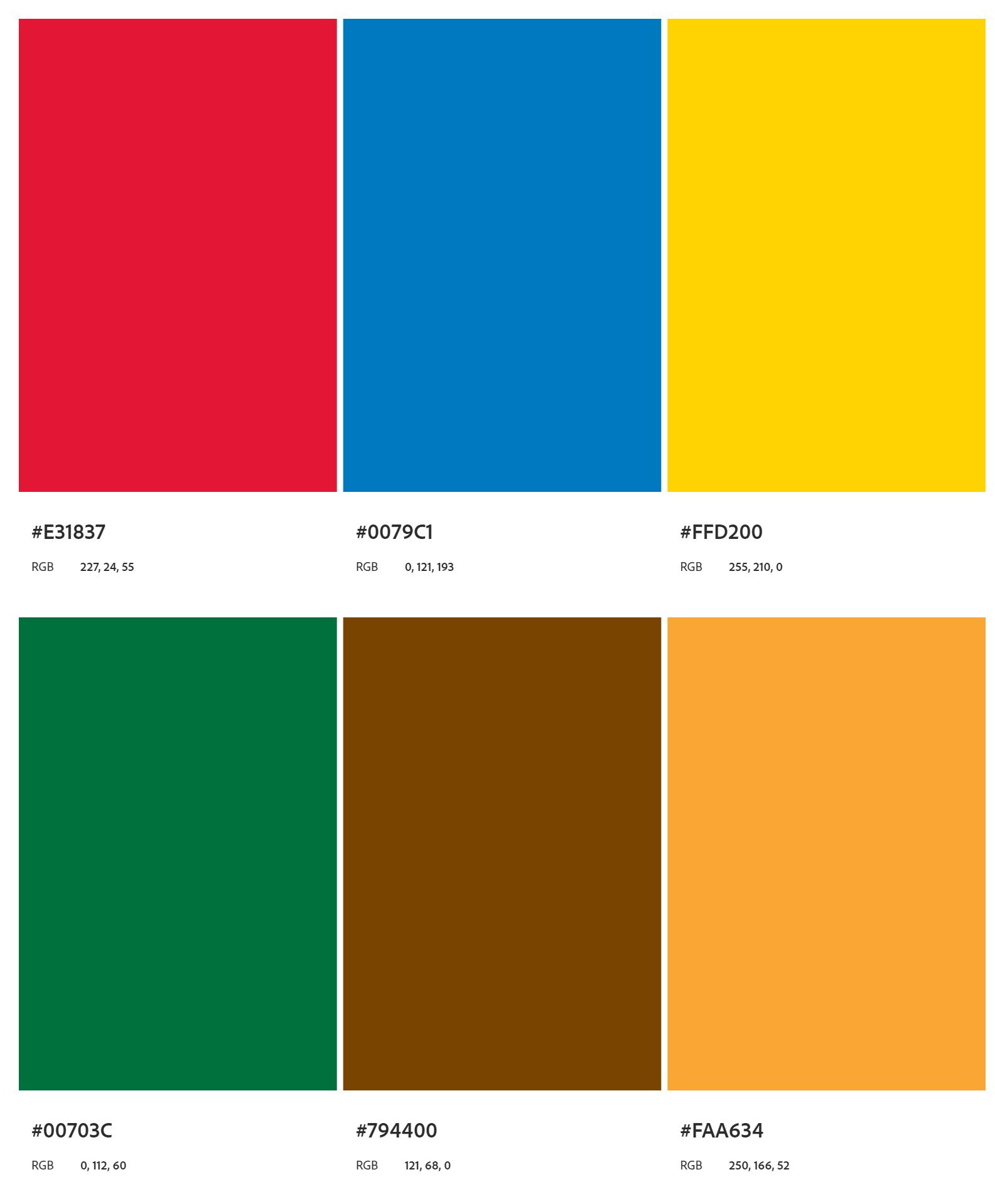
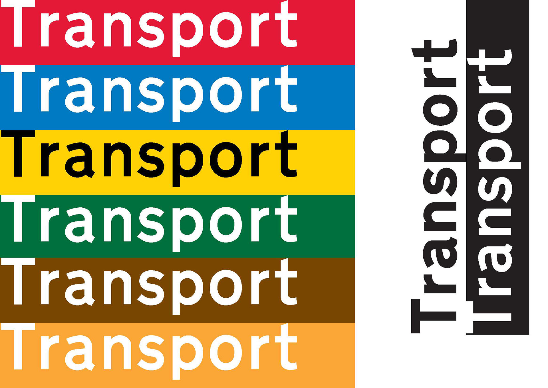
Colour Palette
In order to remain faithful to Transport's rules for type and colour combination, the choice of colours was according to the official guidance provided by the UK Government Department of Transport for road traffic signs reproduction.
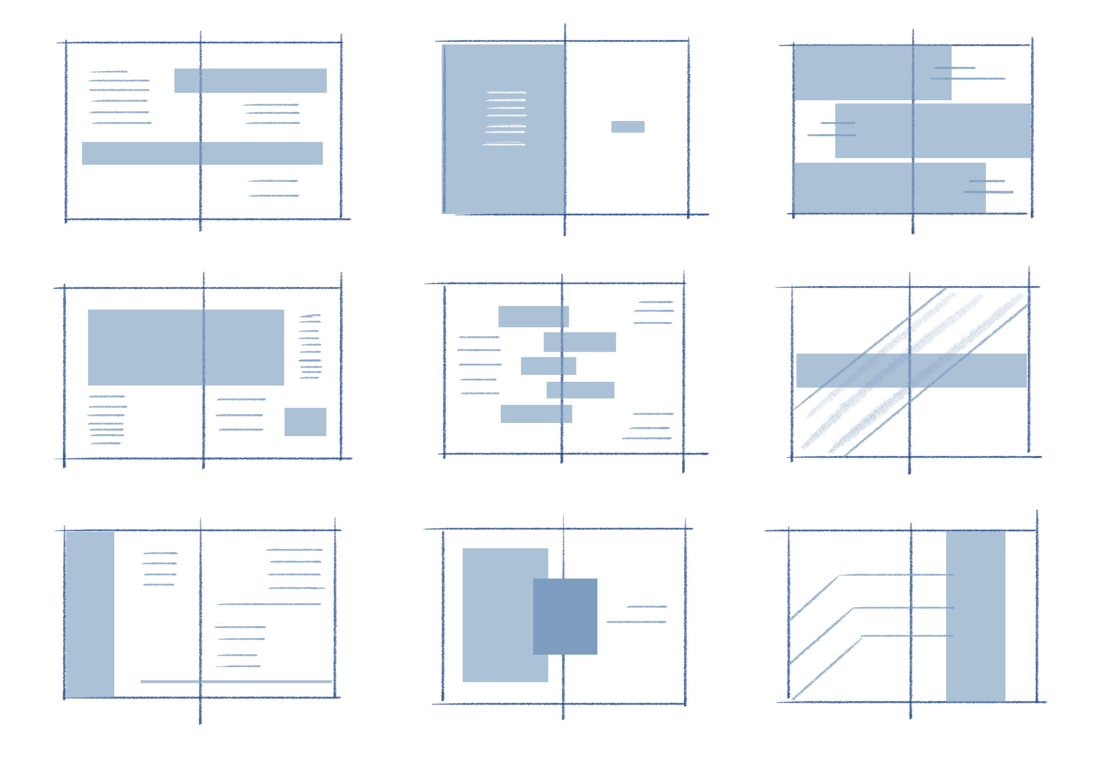
Iterations and Experimentations


Finalised Content Layout
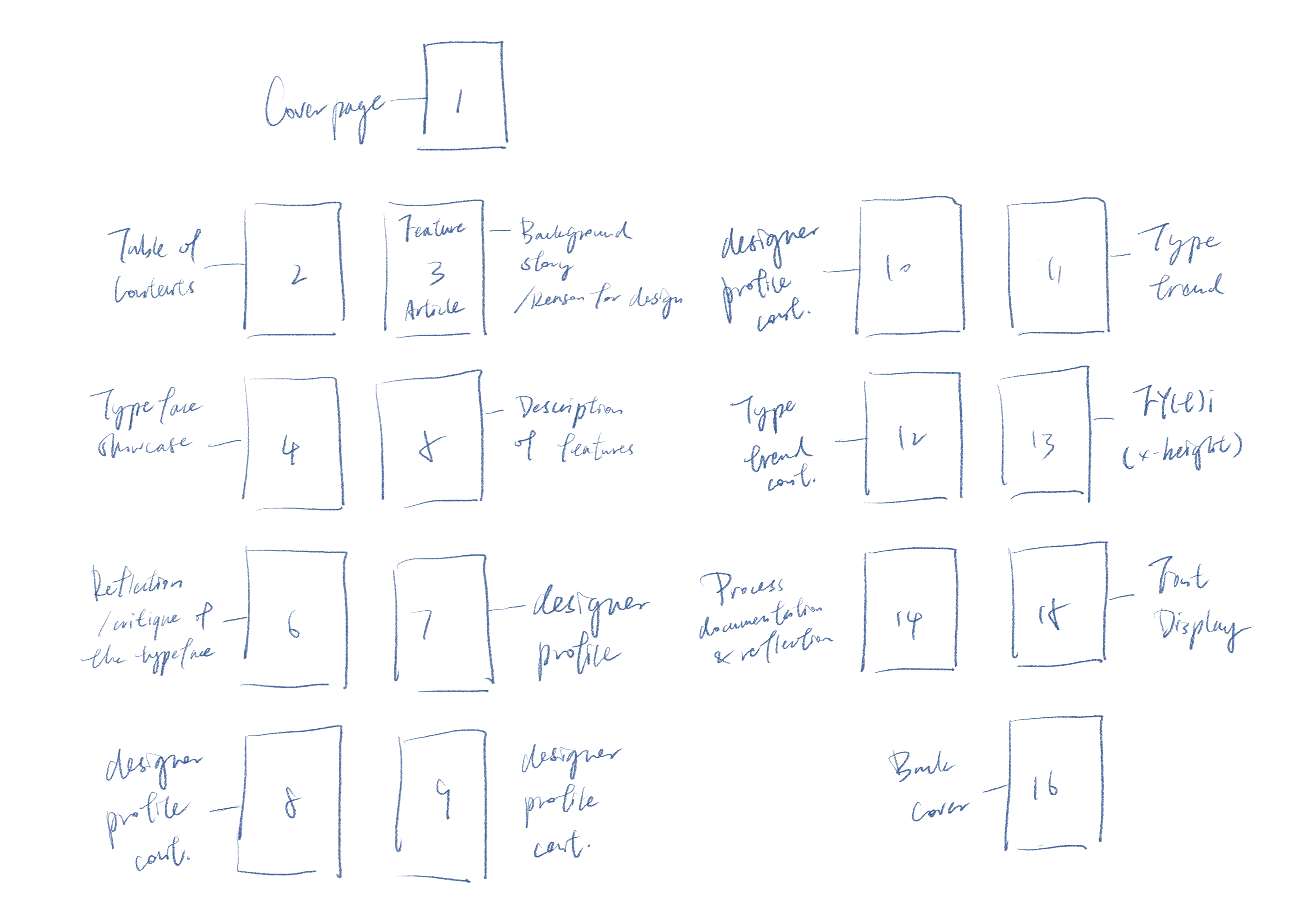
P.1 — Front Cover
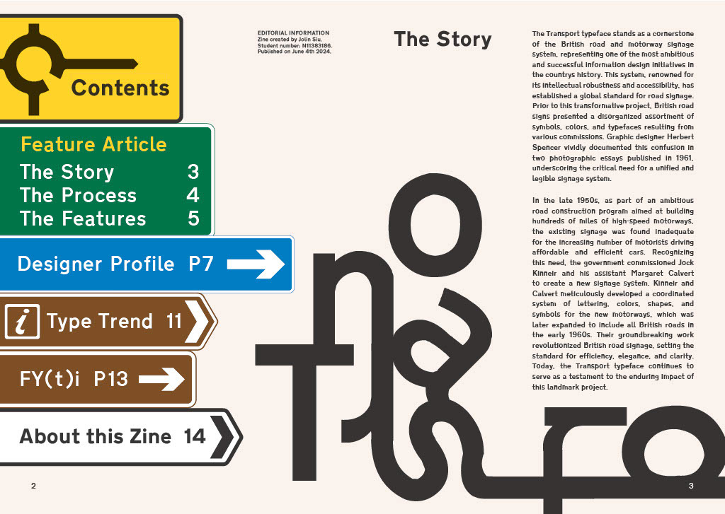
P.2 — Table of Contents
P.3 — Introduction: The Story of Transport
P.4,5 — The Design Process of Transport
P.6 — Features of Transport Medium and Transport Heavy
P.7,8,9 — Profile of Jock Kinnier and Margaret Calvert
P.10 — A Quote From Jock Kinnier
P.11,12 — Type Trend: Quirky Sans Serif
P.13 — FT(t)i: x-height
P.14 — Decoration Page
P.15 — About the Zine
P.16 — Back Cover
Written Text
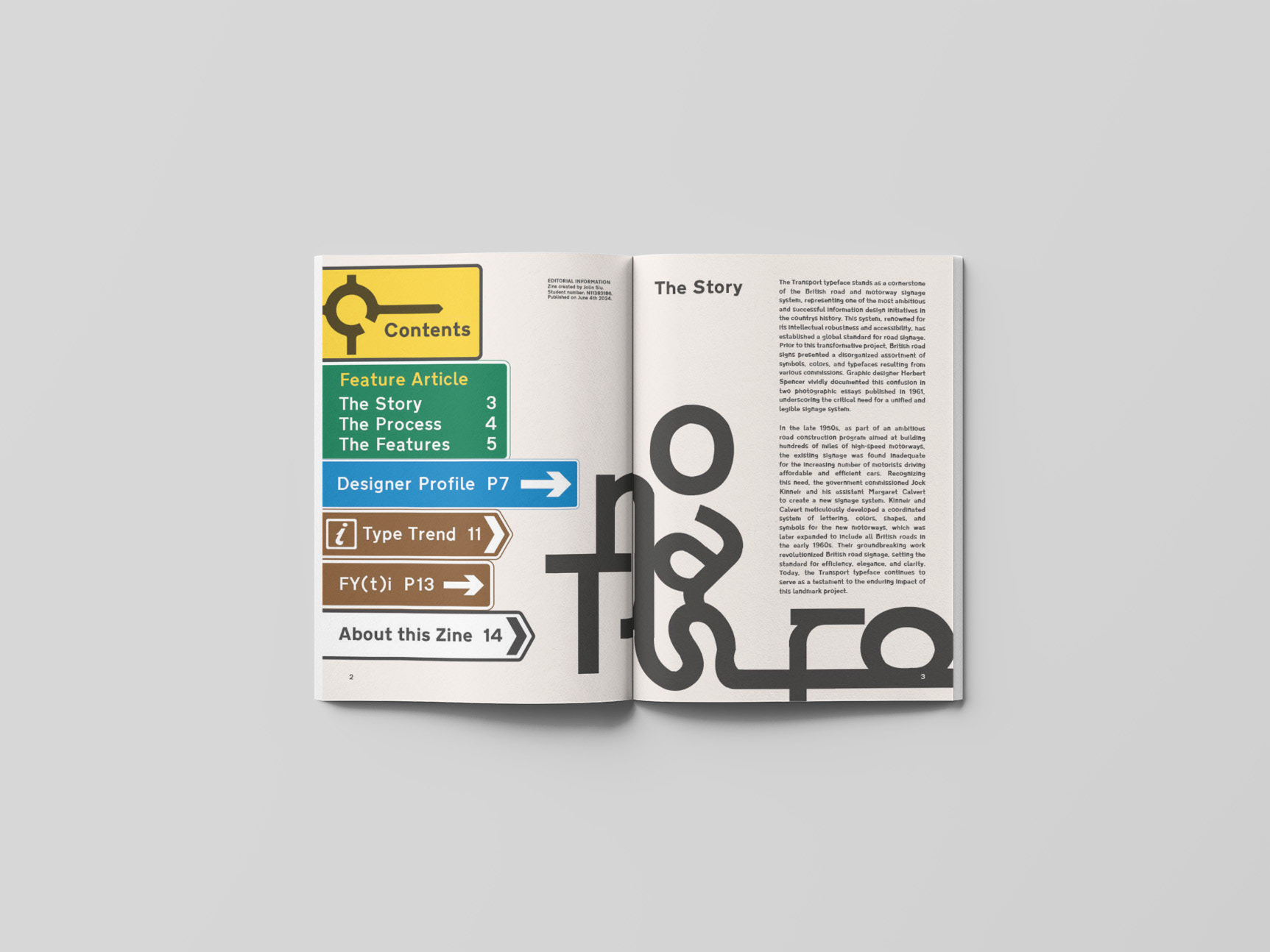
P.2
Contents
Feature Article
The Story
The Process
The Features
Designer Profile
Type Trend
FY(t)i
About this Zine
P.3
The Story
The Transport typeface stands as a cornerstone of the British road and motorway signage system, representing one of the most ambitious and successful information design initiatives in the country’s history. This system, renowned for its intellectual robustness and accessibility, has established a global standard for road signage. Prior to this transformative project, British road signs presented a disorganized assortment of symbols, colors, and typefaces resulting from various commissions. Graphic designer Herbert Spencer vividly documented this confusion in two photographic essays published in 1961, underscoring the critical need for a unified and legible signage system.
In the late 1950s, as part of an ambitious road construction program aimed at building hundreds of miles of high-speed motorways, the existing signage was found inadequate for the increasing number of motorists driving affordable and efficient cars. Recognizing this need, the government commissioned Jock Kinneir and his assistant Margaret Calvert to create a new signage system. Kinneir and Calvert meticulously developed a coordinated system of lettering, colors, shapes, and symbols for the new motorways, which was later expanded to include all British roads in the early 1960s. Their groundbreaking work revolutionized British road signage, setting the standard for efficiency, elegance, and clarity. Today, the Transport typeface continues to serve as a testament to the enduring impact of this landmark project.
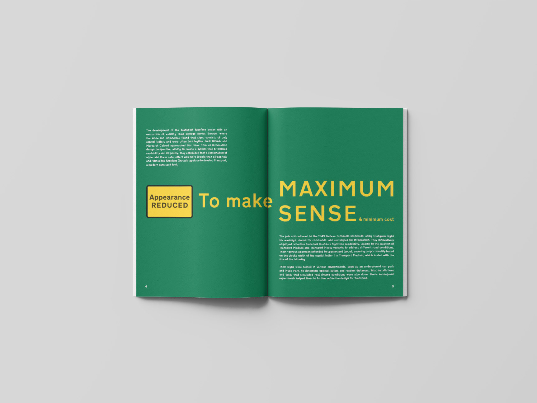
P.4,5
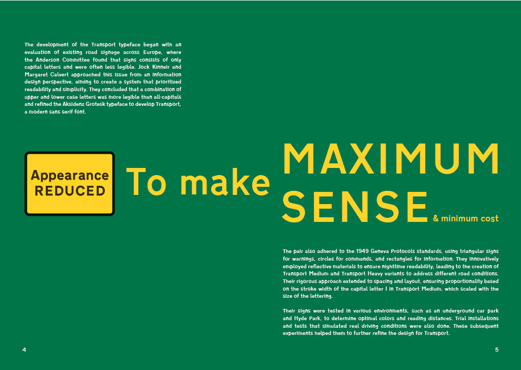
The development of the Transport typeface began with an evaluation of existing road signage across Europe, where the Anderson Committee found that signs consists of only capital letters and were often less legible. Jock Kinneir and Margaret Calvert approached this issue from an information design perspective, aiming to create a system that prioritized readability and simplicity. They concluded that a combination of upper and lower case letters was more legible than all-capitals and refined the Aksidenz Grotesk typeface to develop Transport, a modern sans serif font.
Appearance REDUCED To make MAXIMUM SENSE & minimum cost
The pair also adhered to the 1949 Geneva Protocol’s standards, using triangular signs for warnings, circles for commands, and rectangles for information. They innovatively employed reflective materials to ensure nighttime readability, leading to the creation of Transport Medium and Transport Heavy variants to address different road conditions. Their rigorous approach extended to spacing and layout, ensuring proportionality based on the stroke width of the capital letter “I” in Transport Medium, which scaled with the size of the lettering.
Their signs were tested in various environments, such as an underground car park and Hyde Park, to determine optimal colors and reading distances. Trial installations and tests that simulated real driving conditions were also done. These subsequent experiments helped them to further refine the design for Transport.
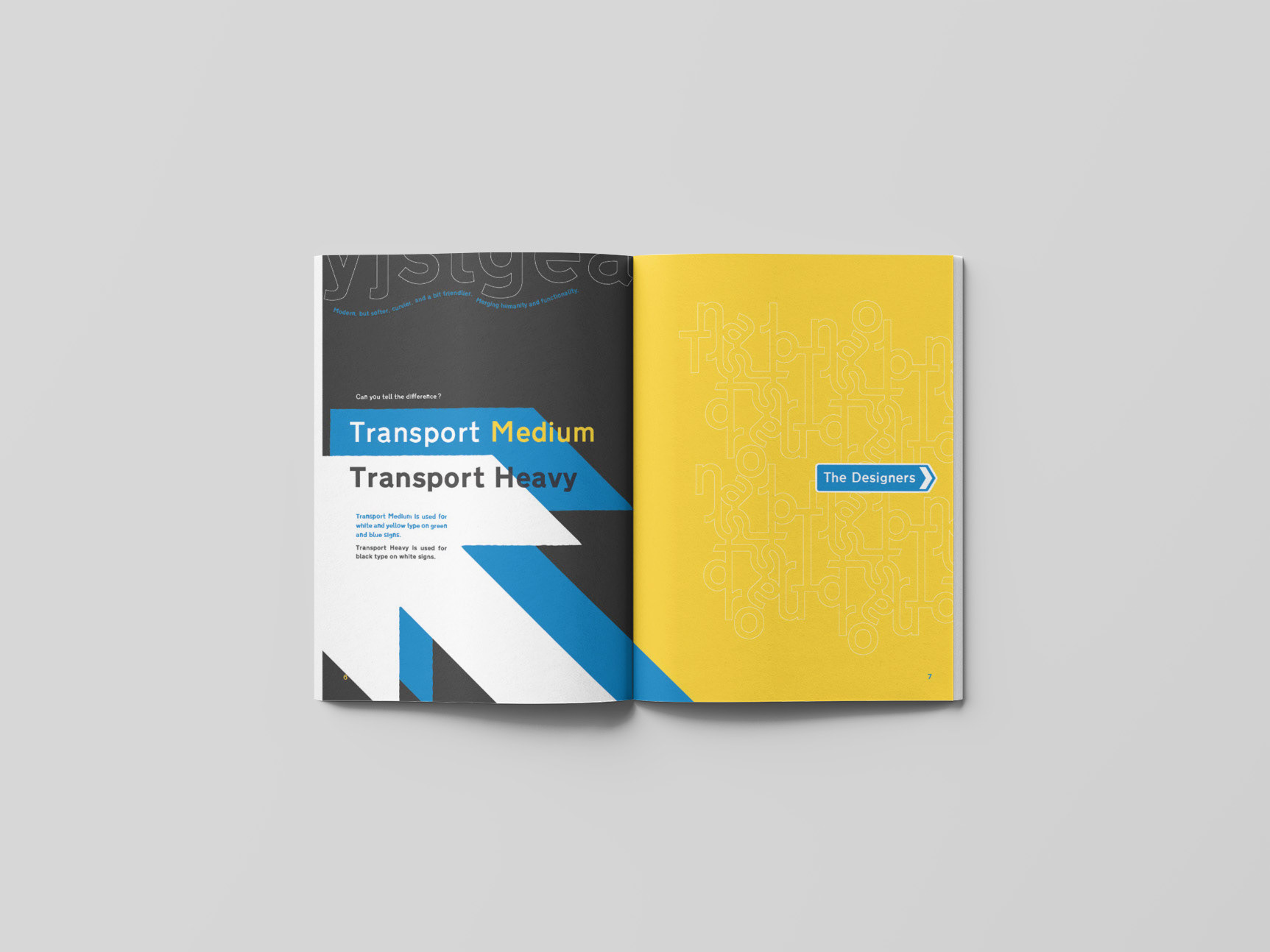
P.6
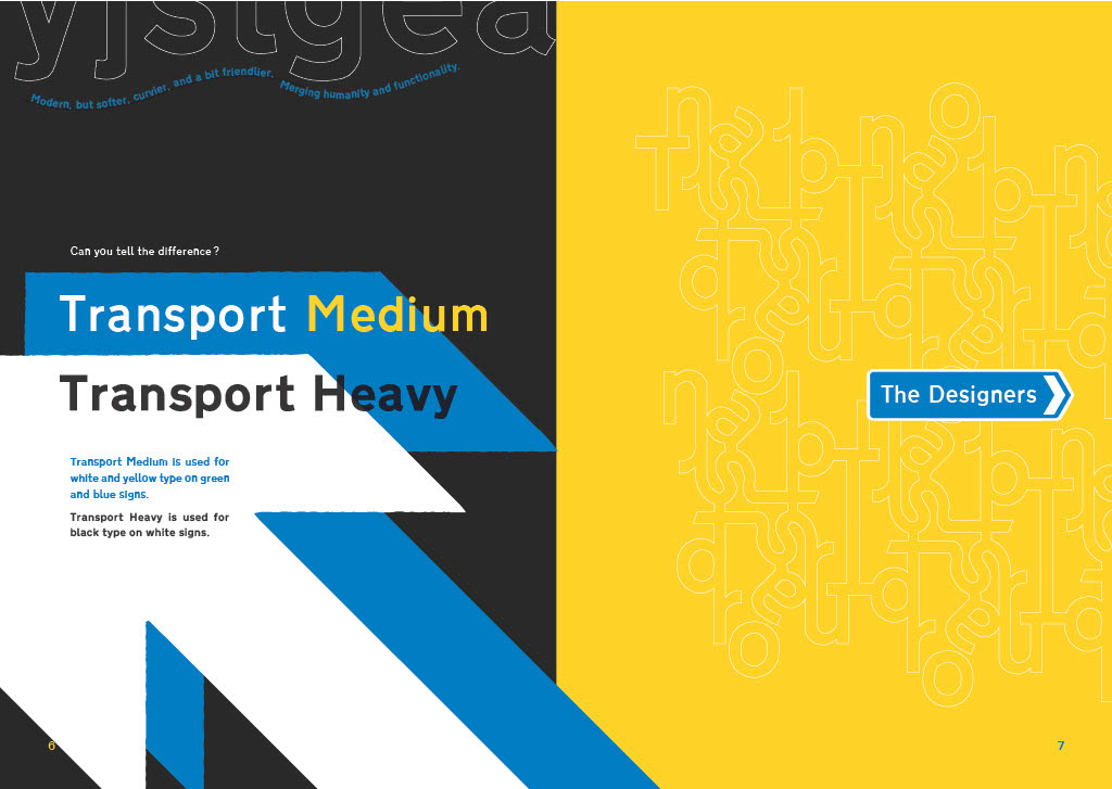
Modern, but softer, curvier, and a bit friendlier. Merging humanity and functionality.
Can you tell the difference?
Transport Medium
Transport Heavy
Transport Medium is used for white and yellow type on green and blue signs.
Transport Heavy is used for black type on white signs.
P.7
The Designers
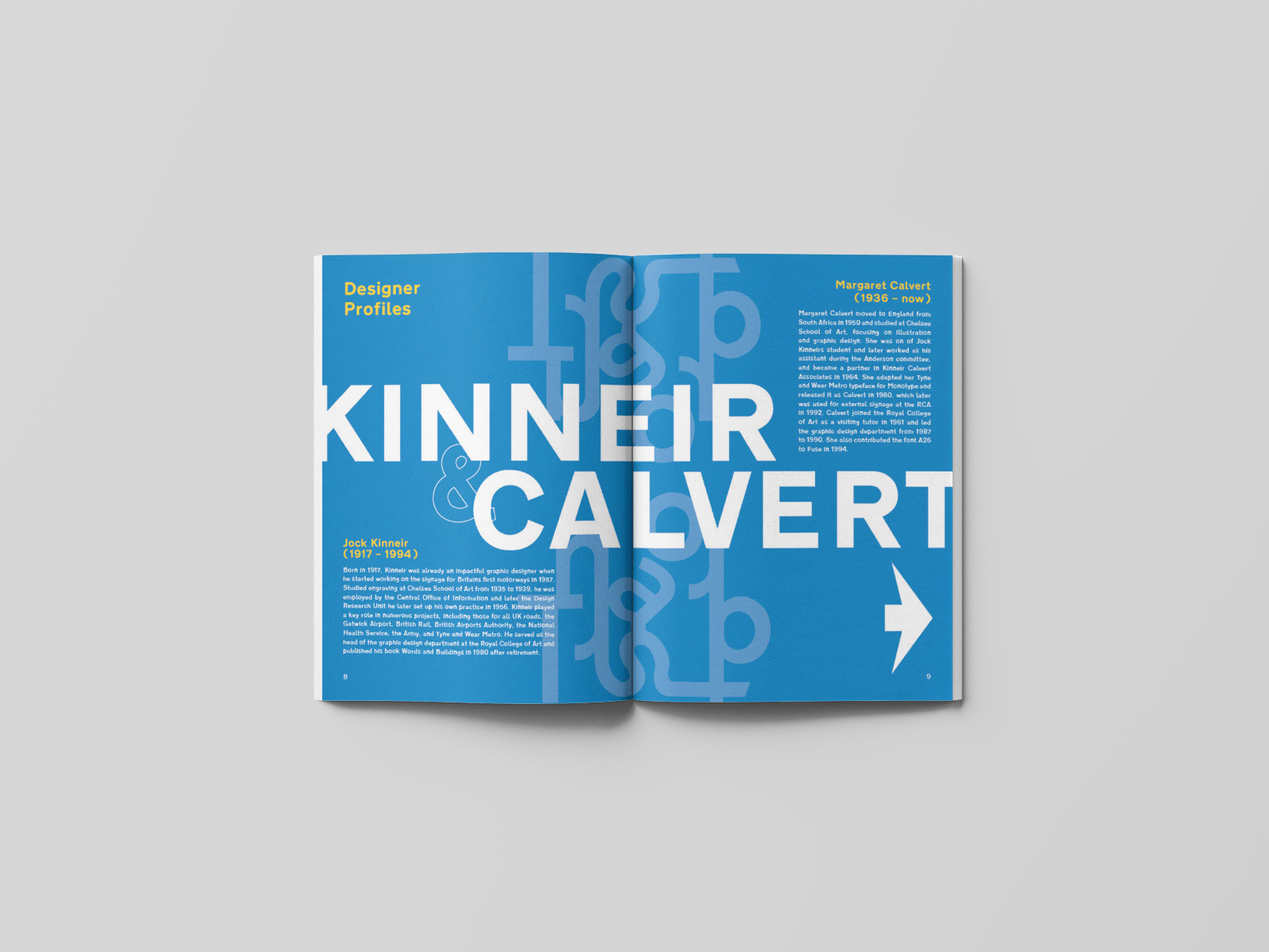
P.8,9
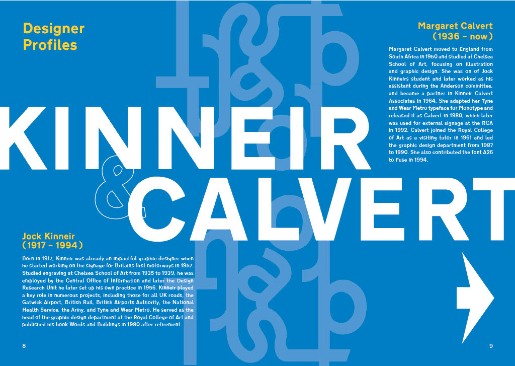
Designer Profiles
KINNEIR & CALVERT
— 1994)
Born in 1917, Kinneir was already an impactful graphic designer when he started working on the signage for Britain’s first motorways in 1957. Studied engraving at Chelsea School of Art from 1935 to 1939, he was employed by the Central Office of Information and later the Design Research Unit; he later set up his own practice in 1956. Kinneir played a key role in numerous projects, including those for all UK roads, the Gatwick Airport, British Rail, British Airports Authority, the National Health Service, the Army, and Tyne and Wear Metro. He served as the head of the graphic design department at the Royal College of Art and published his book Words and Buildings in 1980 after retirement.
Margaret Calvert (1936 — now)
Margaret Calvert moved to England from South Africa in 1950 and studied at Chelsea School of Art, focusing on illustration and graphic design. She was on of Jock Kinneir’s student and later worked as his assistant during the Anderson committee, and became a partner in Kinneir Calvert Associates in 1964. She adapted her Tyne and Wear Metro typeface for Monotype and released it as Calvert in 1980, which later was used for external signage at the RCA in 1992. Calvert joined the Royal College of Art as a visiting tutor in 1961 and led the graphic design department from 1987 to 1990. She also contributed the font A26 to Fuse in 1994.
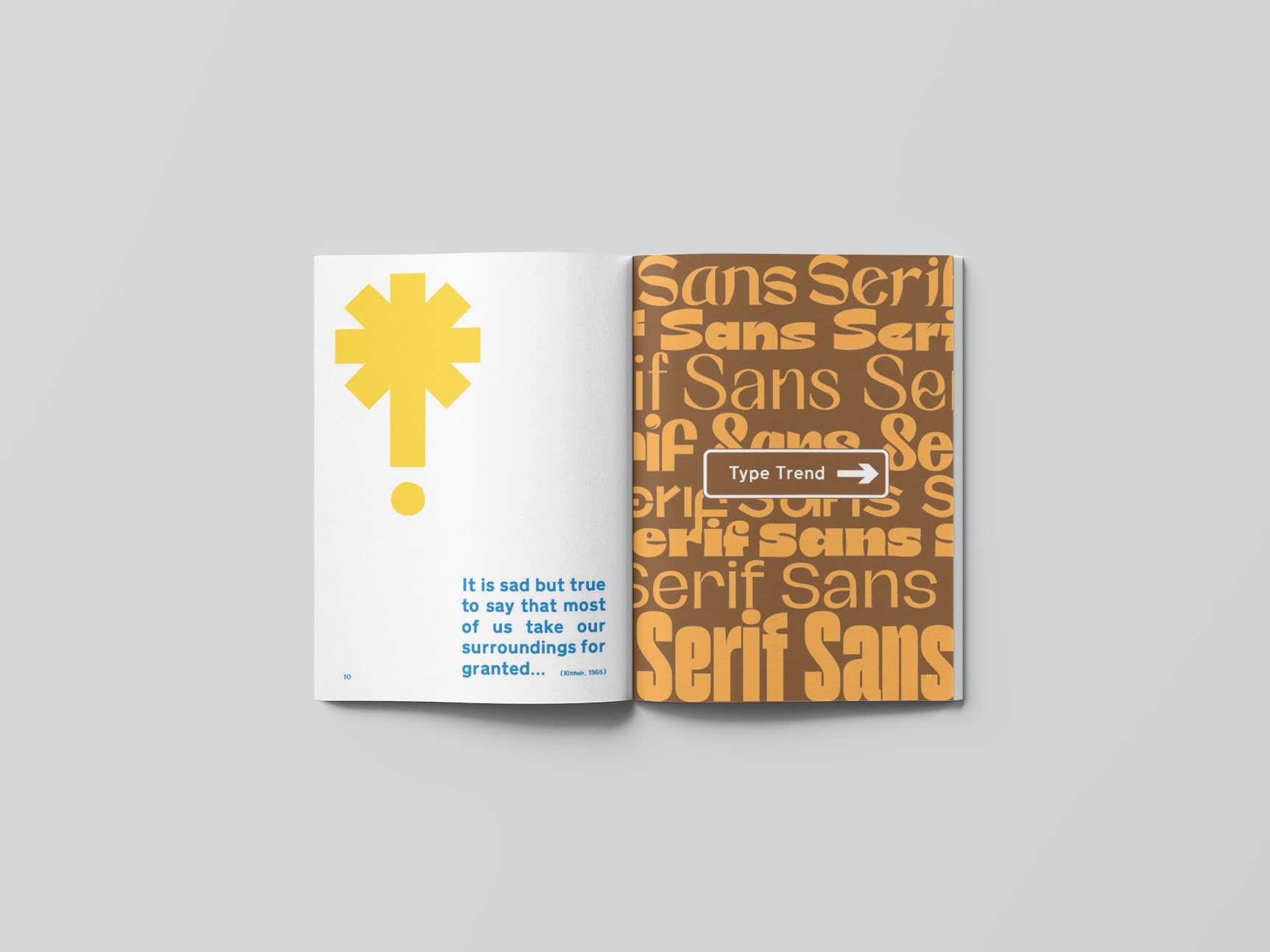
P.10
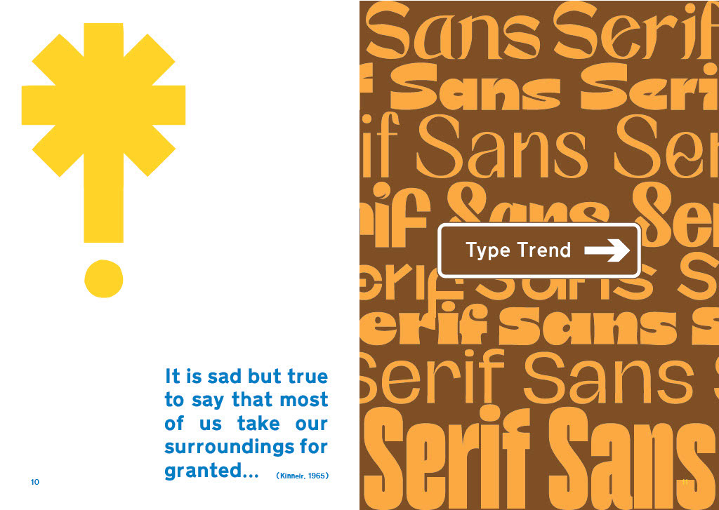
It is sad but true to say that most of us take our surroundings for granted... (Kinneir, 1965)
P.11
Type Trend (Sans Serif)
P.12
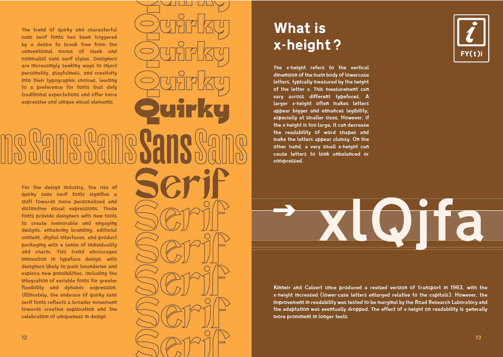
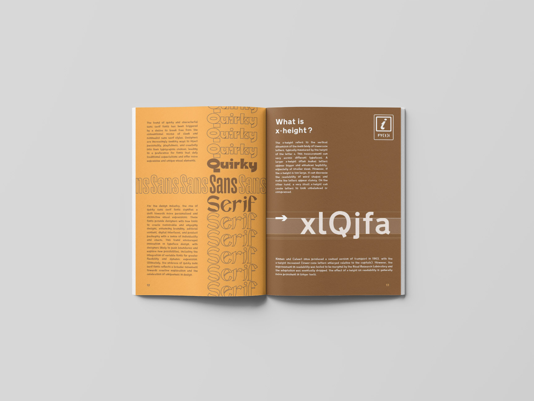
The trend of quirky and characterful sans serif fonts has been triggered by a desire to break free from the conventional norms of sleek and minimalist sans serif styles. Designers are increasingly seeking ways to inject personality, playfulness, and creativity into their typographic choices, leading to a preference for fonts that defy traditional expectations and offer more expressive and unique visual elements.
Quirky Sans Serif
For the design industry, the rise of quirky sans serif fonts signifies a shift towards more personalized and distinctive visual expressions. These fonts provide designers with new tools to create memorable and engaging designs, enhancing branding, editorial content, digital interfaces, and product packaging with a sense of individuality and charm. This trend encourages innovation in typeface design, with designers likely to push boundaries and explore new possibilities, including the integration of variable fonts for greater flexibility and dynamic expression. Ultimately, the embrace of quirky sans serif fonts reflects a broader movement towards creative exploration and the celebration of uniqueness in design.
P.13
What is x-height?
The x-height refers to the vertical dimension of the main body of lowercase letters, typically measured by the height of the letter ‘x’. This measurement can vary across different typefaces. A larger x-height often makes letters appear bigger and enhances legibility, especially at smaller sizes. However, if the x-height is too large, it can decrease the readability of word shapes and make the letters appear clumsy. On the other hand, a very small x-height can cause letters to look unbalanced or compressed.
Kinneir and Calvert once produced a revised version of Transport in 1963, with the x-height increased (lower-case letters enlarged relative to the capitals). However, the improvement in readability was tested to be marginal by the Road Research Laboratory and the adaptation was eventually dropped. The effect of x-height on readability is generally more prominent in longer texts.
P.15
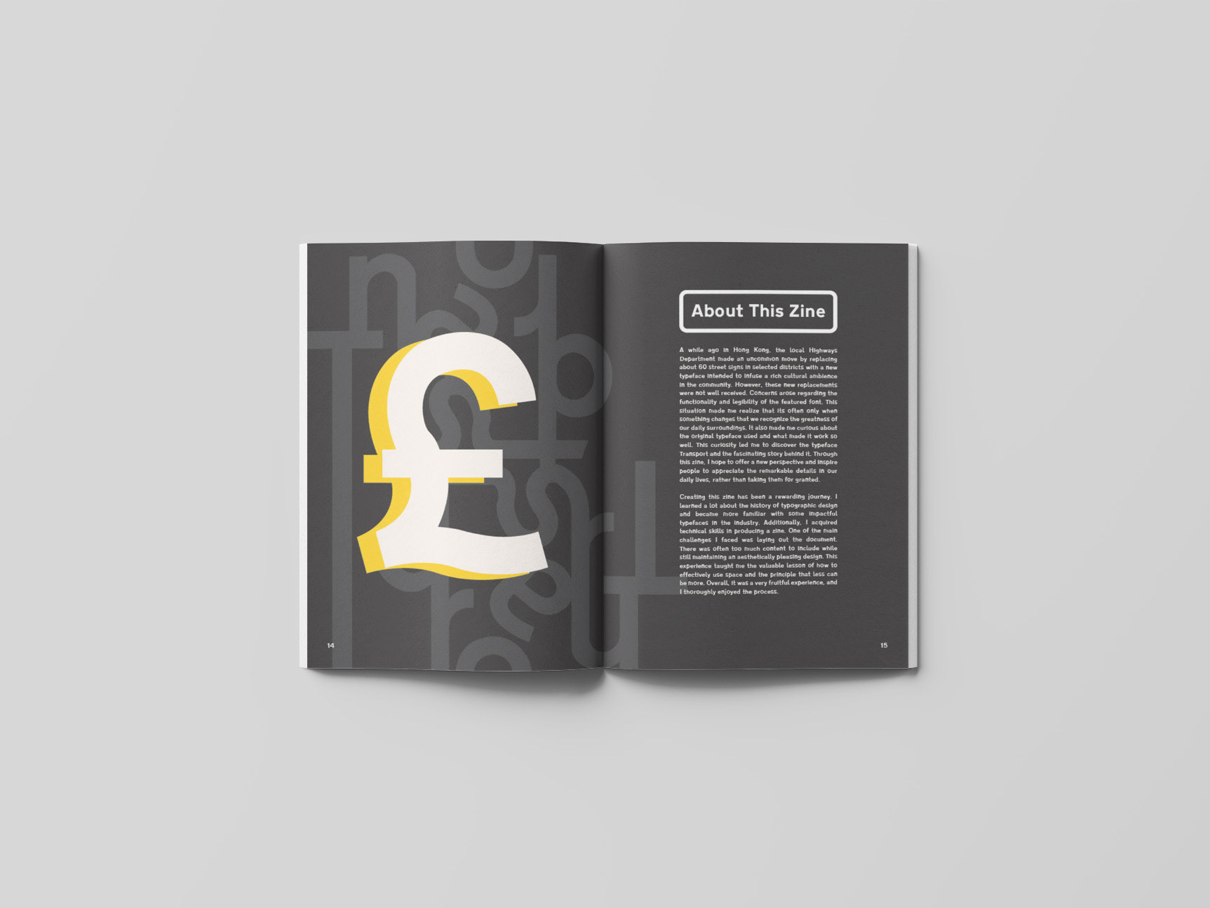
About This Zine
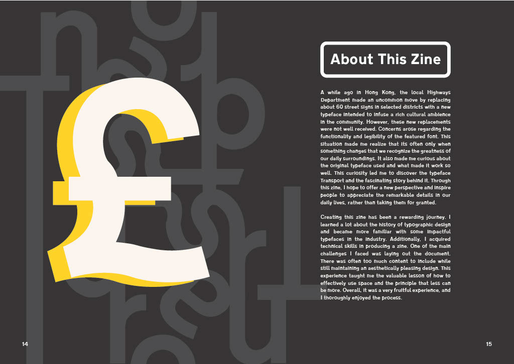
A while ago in Hong Kong, the local Highways Department made an uncommon move by replacing about 60 street signs in selected districts with a new typeface intended to “infuse a rich cultural ambience in the community.” However, these new replacements were not well received. Concerns arose regarding the functionality and legibility of the featured font. This situation made me realize that it’s often only when something changes that we recognize the greatness of our daily surroundings. It also made me curious about the original typeface used and what made it work so well. This curiosity led me to discover the typeface Transport and the fascinating story behind it. Through this zine, I hope to offer a new perspective and inspire people to appreciate the remarkable details in our daily lives, rather than taking them for granted.
Creating this zine has been a rewarding journey. I learned a lot about the history of typographic design and became more familiar with some impactful typefaces in the industry. Additionally, I acquired technical skills in producing a zine. One of the main challenges I faced was laying out the document. There was often too much content to include while still maintaining an aesthetically pleasing design. This experience taught me the valuable lesson of how to effectively use space and the principle that less can be more. Overall, it was a very fruitful experience, and I thoroughly enjoyed the process.
Final Zine Design
References
Baines, P. (1999). A design (to sign roads by). Eye Magazine.
Craft Supply Co. (2023, Dec 24). The Allure of Quirky and Characterful Sans Serif Fonts. Medium.
The Design Museum. (n.d.). JOCK KINNEIR AND MARGARET CALVERT: Designers of the modern British road signage system that has become a role model around the world.
Willen, B., & Strals, N. (2009). Lettering and type : Creating letters and designing typefaces. Princeton Architectural Press.
Resources
Department for Transport. (2023). Know Your Traffic Signs.
GOV UK. (2013). Road traffic sign images for reproduction.
Luciano, J. (n.d.). Magazine Mockup 01. Minimal Mockups.
Mockups Design. (n.d.). A4 brochure mockup.